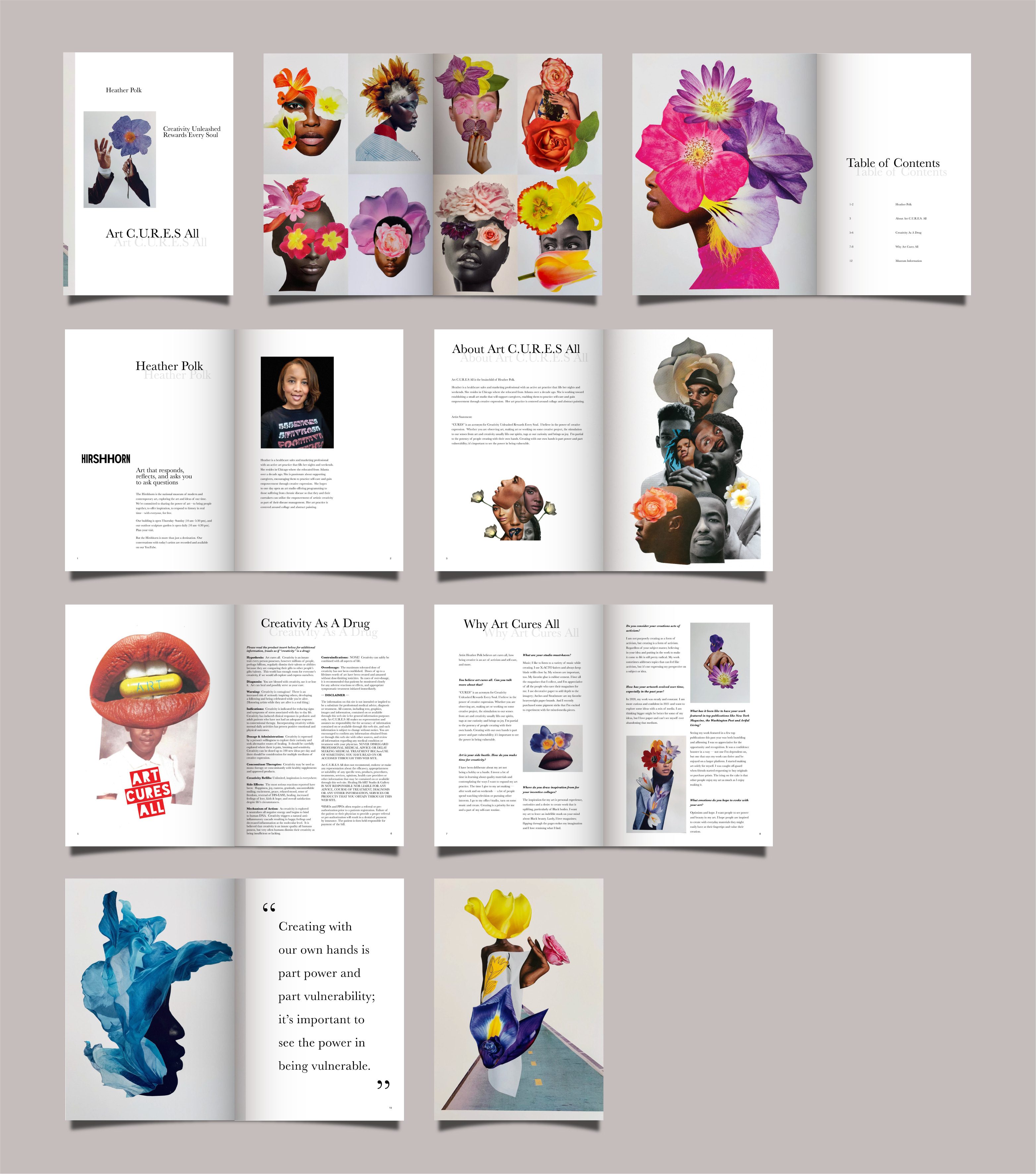
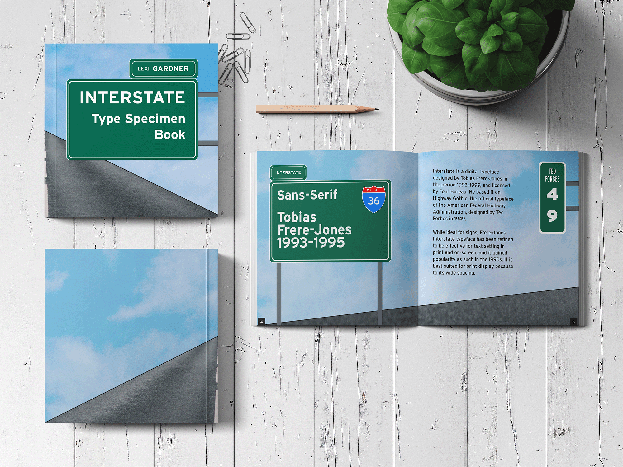
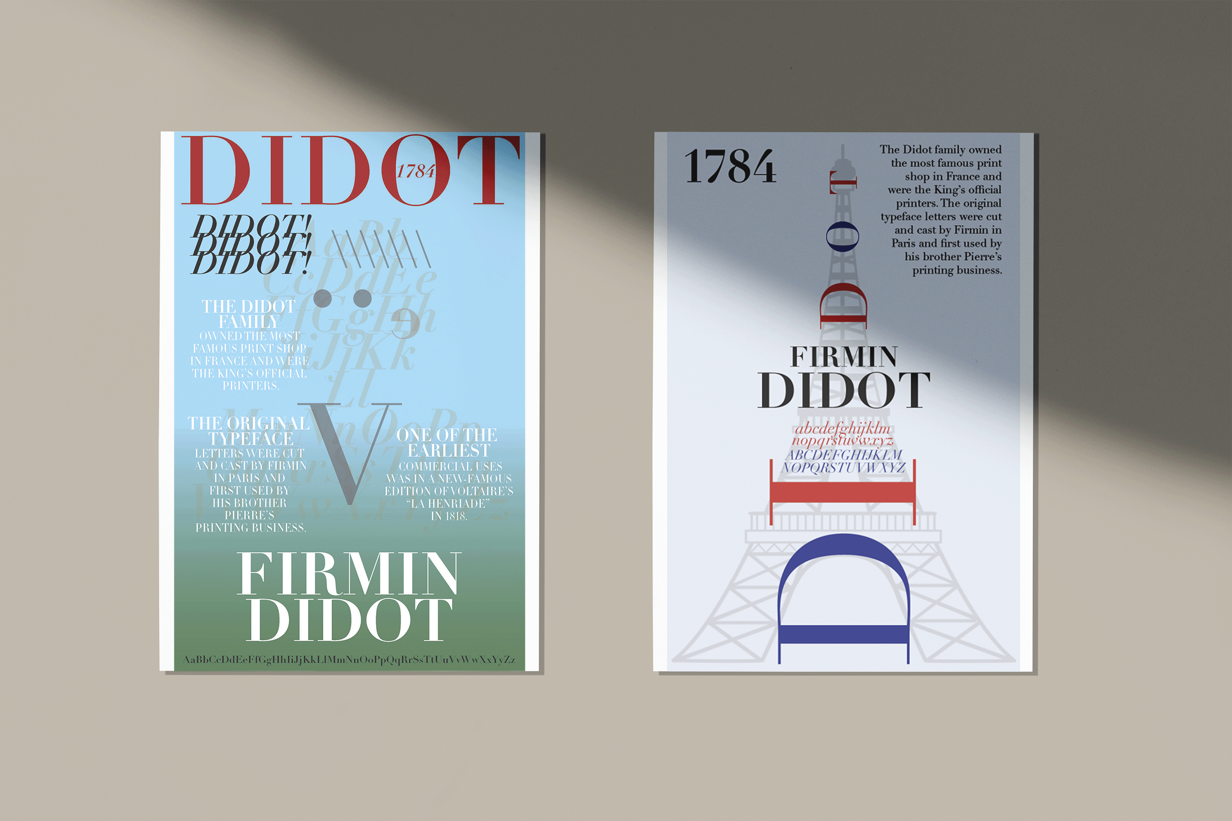
After an initial brand audit it was determined that the City of Boston needed a new brand identity that places more focus on the distinctiveness of historic architecture of the city.
The city currently uses a color palette of bright red, blue, and a grounding white, to represent their “certain boldness.”
I believe that it is possible to carry out this same level of boldness and efficiently represent history using different colors. In my work, I rebranded the city of Boston using the colors, dark teal, brown, and burnt orange. I also used typography that reflects beautiful scenery and old history in a rustic style. My design deviates away from the well-known sport scene and places more focus on Boston’s historic architecture.
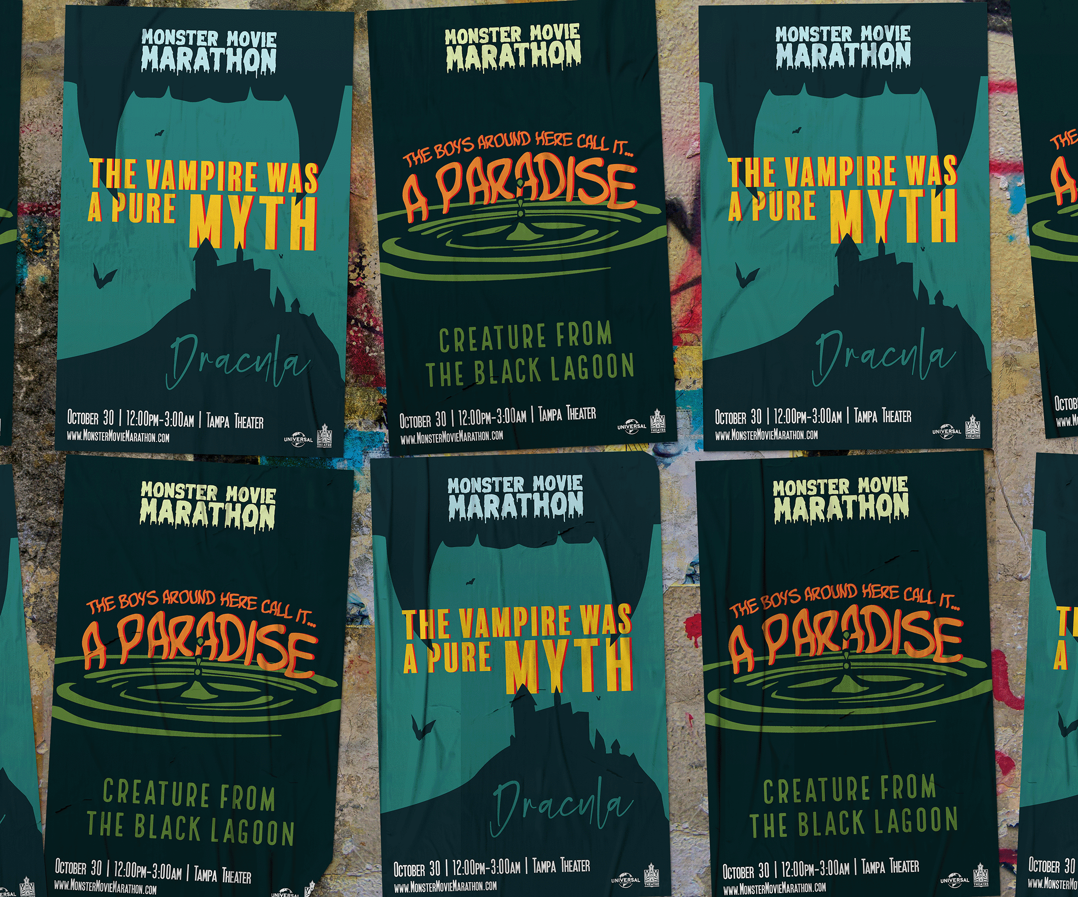
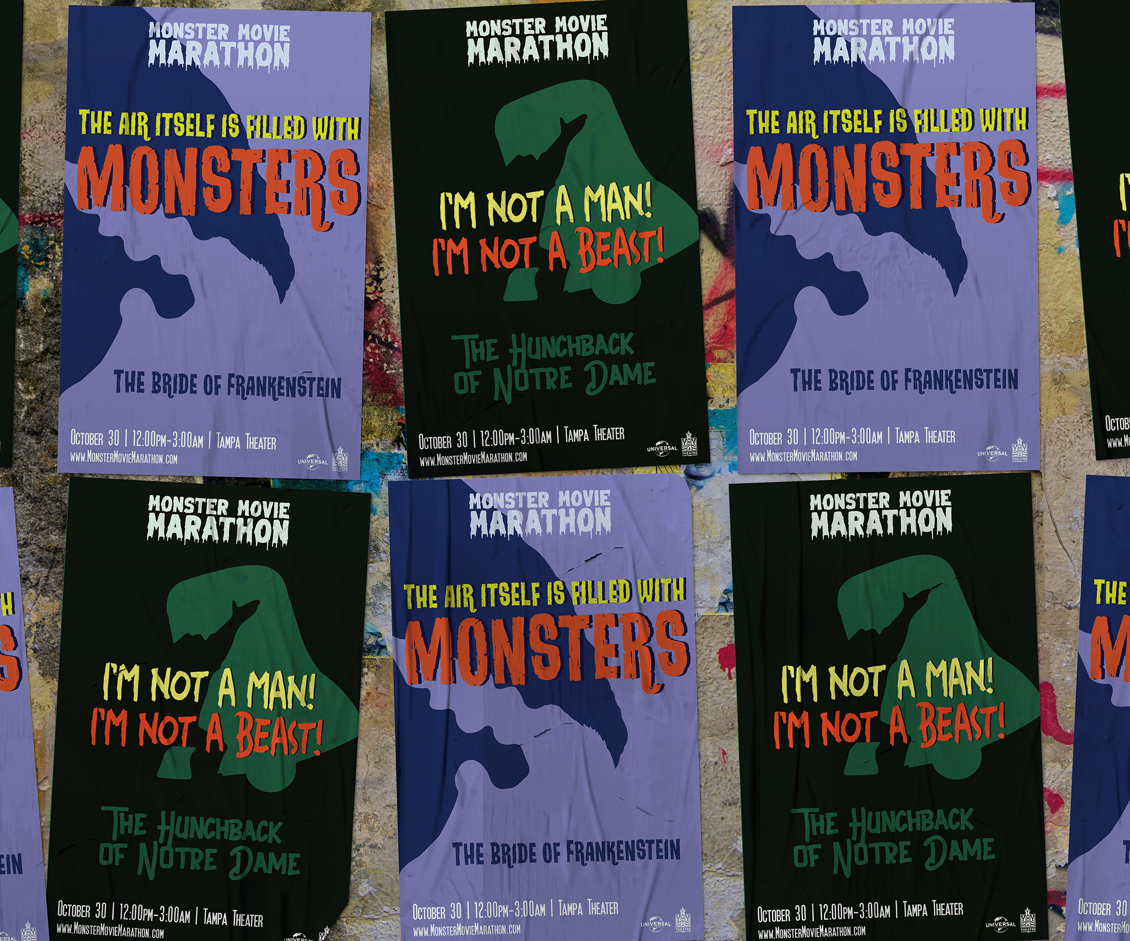
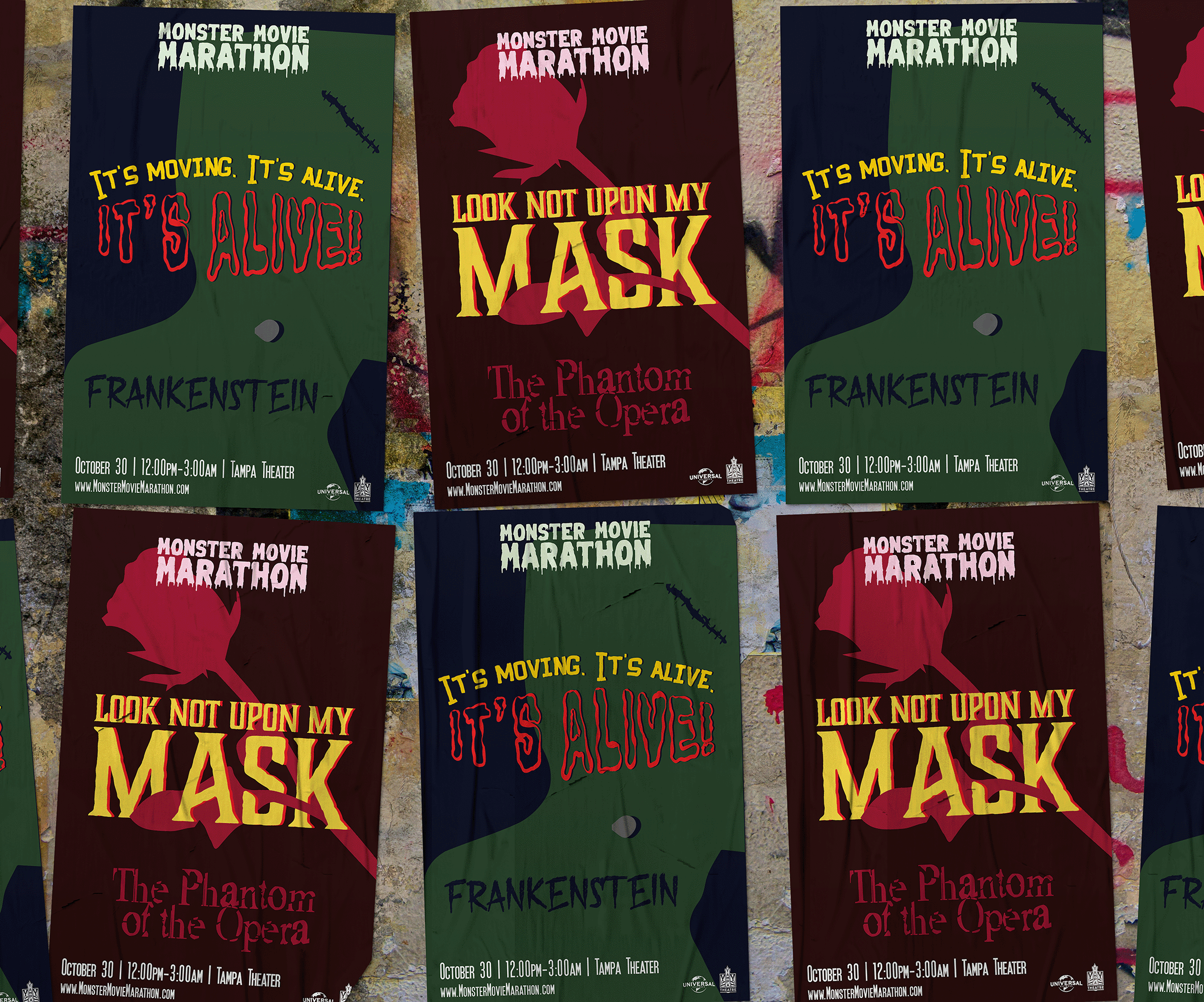
Click on the image to view the full set of city rebrand materials.